By Hally Peck
When we launched Addition Wealth out of stealth, one of the first things we needed to figure out was who we were - not just as a company, but as a brand. What did we stand for? What did we want people to feel when they came across us for the first time?
We knew from the beginning that we wanted to be friendly, approachable, professional, and trustworthy. We wanted a brand that could meet people where they were, whether they were navigating something exciting or something deeply challenging in their financial lives. We wanted to be the kind of financial partner that felt human, not intimidating. We kept coming back to this idea of wanting to be the friend you always go to for financial advice.
That brand has served us well. It helped us build something we’re incredibly proud of, a platform that’s helped people across the country buy their first homes, welcome their first children, navigate divorce, adopt, plan families, care for aging parents, go through equity events, and more. We’ve been there for people during the most important (and sometimes difficult) financial moments of their lives, and our original brand gave us the foundation to do that work with empathy and clarity.
But over the last few years, we’ve grown in size, in scope, and in maturity. So we knew it was time for our brand to evolve with us.

Why Now?
In the early days, we primarily focused on supporting employees through their employers. Today, we still do that, and we’ve expanded significantly, partnering with financial institutions and building a configurable tech platform that helps organizations deliver personalized financial expertise at scale.
That growth, both in our audience and our product, created a natural inflection point. We weren’t trying to reinvent ourselves. We were simply ready to better reflect who we are today and also who we’re becoming.
The result is a refreshed brand identity that builds on our past while looking confidently toward the future.
What We Kept and Why
At its core, the new brand maintains everything we’ve always cared about. It’s approachable, friendly, trustworthy, and professional. This is not a departure, it’s an iteration.
The goal was to evolve, not erase. And we asked ourselves, “How do we stay recognizably “us,” while making room for growth, flexibility, and modernity?”
Here’s how we brought that to life
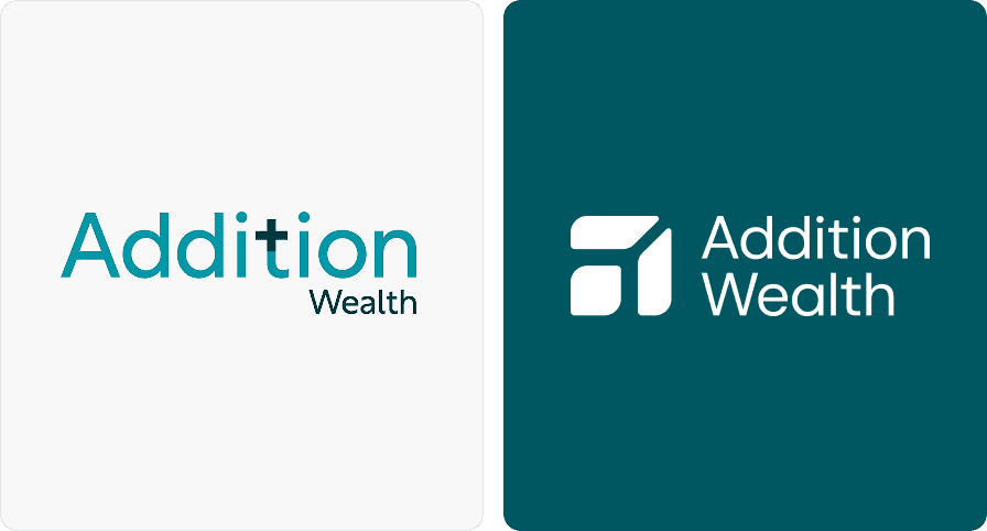
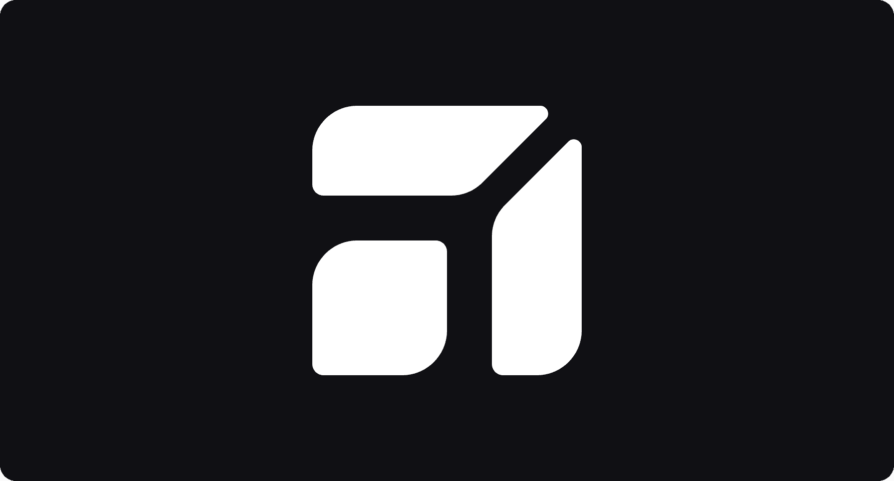
The Logomark: Familiar, Yet Forward-Looking
Our new logomark is one of the most noticeable changes, but it’s also one of the most symbolic. At first glance, it feels modern and refined. Look a little closer, and you’ll notice the familiar leaf motif and soft curvature that have always been part of our identity.
It’s also shaped like an “a” for Addition Wealth, anchoring us in who we are. The geometry and structure convey steady, step-by-step growth, just like how people build financial confidence. It may be a small mark, but it carries a lot of meaning.

Our Color Palette: Emotion, Continuity, and Contrast
Color is emotional. And our colors, especially our core teal and warm accent tones, evoke the qualities that matter most to us: calm, clarity, optimism, and inclusion.
We’ve kept the palette largely the same but added depth and range through additional accent shades and contrast options. These allow us to express more (across interfaces, data visualizations, illustrations, and more) while staying true to the palette people already associate with Addition Wealth.
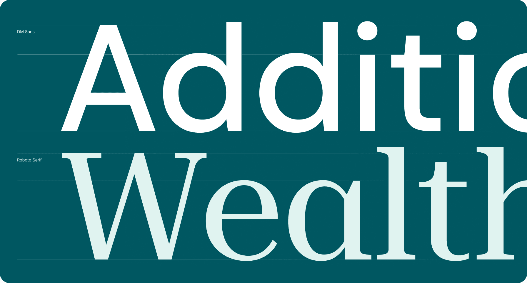
Typography: Clarity That Reflects Confidence
We took a thoughtful approach to typography, balancing personality with legibility. DM Sans gives us a friendly, clean, digital-forward feel. Roboto Serif brings elegance and warmth, especially in editorial contexts. Inter supports long-form reading and digital clarity. Together, they create a flexible system that feels both contemporary and welcoming.
Interestingly, we’ve come full circle. Some of our initial prototypes were DM Sans and Roboto, and it’s now reintroduced in a refined way, giving the brand a sense of continuity and grounding.
A Brand That Grows With You
This rebrand isn’t just about us. It’s about the clients and people we serve.
Our updated identity reflects our belief that financial health is foundational to overall wellbeing. It reflects the clarity, simplicity, and confidence we strive to deliver through every product feature, advisor conversation, and partner experience.
It’s also a reflection of our commitment to you – our customers, clients, partners, and team. We're growing, and we’re doing it together.
What’s Next
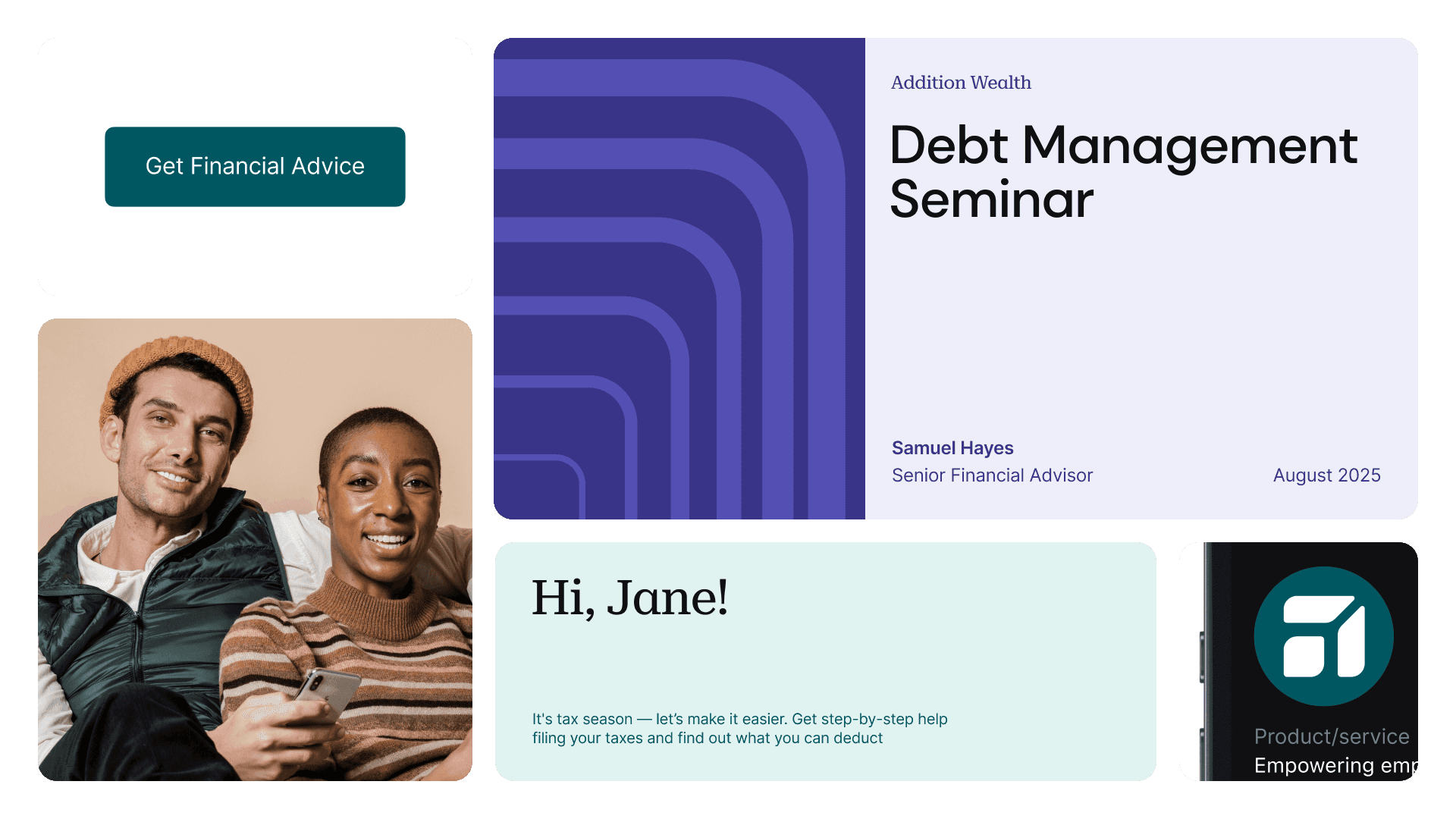
You’ll start to see the new identity rolled out across our website, mobile experiences, communications, and marketing channels. We’re excited about the tools this updated system gives us to communicate with even more clarity, flexibility, and purpose.
But more than anything, we’re excited for what comes next for you, for us, and for the future of financial wellness.
Thanks for being on this journey with us.
By Hally Peck
When we launched Addition Wealth out of stealth, one of the first things we needed to figure out was who we were - not just as a company, but as a brand. What did we stand for? What did we want people to feel when they came across us for the first time?
We knew from the beginning that we wanted to be friendly, approachable, professional, and trustworthy. We wanted a brand that could meet people where they were, whether they were navigating something exciting or something deeply challenging in their financial lives. We wanted to be the kind of financial partner that felt human, not intimidating. We kept coming back to this idea of wanting to be the friend you always go to for financial advice.
That brand has served us well. It helped us build something we’re incredibly proud of, a platform that’s helped people across the country buy their first homes, welcome their first children, navigate divorce, adopt, plan families, care for aging parents, go through equity events, and more. We’ve been there for people during the most important (and sometimes difficult) financial moments of their lives, and our original brand gave us the foundation to do that work with empathy and clarity.
But over the last few years, we’ve grown in size, in scope, and in maturity. So we knew it was time for our brand to evolve with us.
Why Now?
In the early days, we primarily focused on supporting employees through their employers. Today, we still do that, and we’ve expanded significantly, partnering with financial institutions and building a configurable tech platform that helps organizations deliver personalized financial expertise at scale.
That growth, both in our audience and our product, created a natural inflection point. We weren’t trying to reinvent ourselves. We were simply ready to better reflect who we are today and also who we’re becoming.
The result is a refreshed brand identity that builds on our past while looking confidently toward the future.
What We Kept and Why
At its core, the new brand maintains everything we’ve always cared about. It’s approachable, friendly, trustworthy, and professional. This is not a departure, it’s an iteration.
The goal was to evolve, not erase. And we asked ourselves, “How do we stay recognizably “us,” while making room for growth, flexibility, and modernity?”
Here’s how we brought that to life
The Logomark: Familiar, Yet Forward-Looking
Our new logomark is one of the most noticeable changes, but it’s also one of the most symbolic. At first glance, it feels modern and refined. Look a little closer, and you’ll notice the familiar leaf motif and soft curvature that have always been part of our identity.
It’s also shaped like an “a” for Addition Wealth, anchoring us in who we are. The geometry and structure convey steady, step-by-step growth, just like how people build financial confidence. It may be a small mark, but it carries a lot of meaning.
Our Color Palette: Emotion, Continuity, and Contrast
Color is emotional. And our colors, especially our core teal and warm accent tones, evoke the qualities that matter most to us: calm, clarity, optimism, and inclusion.
We’ve kept the palette largely the same but added depth and range through additional accent shades and contrast options. These allow us to express more (across interfaces, data visualizations, illustrations, and more) while staying true to the palette people already associate with Addition Wealth.
Typography: Clarity That Reflects Confidence
We took a thoughtful approach to typography, balancing personality with legibility. DM Sans gives us a friendly, clean, digital-forward feel. Roboto Serif brings elegance and warmth, especially in editorial contexts. Inter supports long-form reading and digital clarity. Together, they create a flexible system that feels both contemporary and welcoming.
Interestingly, we’ve come full circle. Some of our initial prototypes were DM Sans and Roboto, and it’s now reintroduced in a refined way, giving the brand a sense of continuity and grounding.
A Brand That Grows With You
This rebrand isn’t just about us. It’s about the clients and people we serve.
Our updated identity reflects our belief that financial health is foundational to overall wellbeing. It reflects the clarity, simplicity, and confidence we strive to deliver through every product feature, advisor conversation, and partner experience.
It’s also a reflection of our commitment to you – our customers, clients, partners, and team. We're growing, and we’re doing it together.
What’s Next
You’ll start to see the new identity rolled out across our website, mobile experiences, communications, and marketing channels. We’re excited about the tools this updated system gives us to communicate with even more clarity, flexibility, and purpose.
But more than anything, we’re excited for what comes next for you, for us, and for the future of financial wellness.
Thanks for being on this journey with us.


